Pop-up marketing can be a double-sided coin that can either make or break the user experience. Some websites can see up to a 60% conversion rate with the help of pop-ups, while others get high bounce rates and end up losing visitors that might never come back.
The guide below explores how to better manage pop-up marketing campaigns and highlights the following:
- what types of pop-ups marketing campaigns exist
- what tips to follow to increase conversions
- what mistakes to avoid when setting them up
Types of Pop-Up Marketing Campaigns
Pop-up marketing can be categorized into four main groups:
- Entry pop-ups – appear right after the visitor lands on the website. These types of pop-ups can be annoying if the window covers the whole page and typically does not allow the visitor to consume the website content.
- Timely pop-ups – they appear after the visitor has spent a few seconds or minutes on the website. They can be a great way to engage inactive or confused visitors and encourage them to take action.
- Scroll pop-ups – they appear after the visitor scrolls down and skims a certain percentage of the page. Website owners who opt for such pop-ups should be sure not to worsen user experience with a full-screen or hard-to-close window.
- Exit pop-ups – they appear when the visitor tries to go back to a previous tab or tries to close the tab. Such pop-ups are typically considered to be the best-performing banners, as they can retain visitors who were planning to leave a website.

Why Use Pop-Ups on Your Website?
Many believe that pop-ups are annoying to the users but as a matter of fact, they are a great tool for lead generation. Here are a few reasons to add them to your website:
100% Of Your Visitors See Them*
If you share offers via email, SMS, or social networks, you may not be guaranteed that all your subscribers or followers will see them. Pop-ups can allow you to place such offers right in front of all your visitors and can be hard to ignore because they typically appear immediately as users visit a site.
No matter what size your pop-up is or on which part of the page it appears, visitors are typically bound to explore the content on it. And the brighter your pop-up design is the more it may be appealing to users, and the higher your chances of converting a visitor are.
*Exit popups are not seen by users accessing your site through a mobile device. There may be other cases where popups do not show (e.g., when the customer is using an ad-blocker).
They Can Support Your Lead Generation Efforts
Digital marketers often regard pop-ups as one of the most effective tactics in lead generation.
In fact, Campaign Monitor reports that the average rate for pop-ups is 3.09%. If you manage to take your pop-up design to the next level, you can ensure up to a 60% conversion rate.
Farasat Khan, Growth Marketing SEO Specialist at IsItWP, maintains that pop-ups are a valuable source for lead generation, and in fact, IsItWP uses them based on predefined parameters. For the company’s pop-up marketing, the scroll trigger is tagged with a 50%-page scroll and the time-based display is tagged with a 50 seconds timer. This means that the relevant popup ads are displayed based on whichever event triggers first.
This does not tend to annoy visitors since they are already engaged with website content and more motivated to click on the offer. This can not only help to reduce the bounce rate but can also improve the conversion rate for email subscribers, as well as sales.
They Can Improve Overall UX
Pop-ups can help you guide your visitors and offer them something they may potentially be interested in. Think of a situation in which your website visitor is confused and you are able to lend a helping hand or surprise him or her with a creative and memorable message.
11 Tips Behind a Successful Pop-up Marketing
Let’s uncover the secret of how to make a pop-up campaign that will help you convert more leads into customers.
Show Unique Pop-Up Advertisements for Unique Groups of Visitors
You typically have two types of visitors landing on your website – first-time visitors and returning visitors. The type of pop-up to show a user will depend on what actions are taken upon their visit to your website.
For example, if a visitor lands on your website for the first time, “Get free shipping on your first order” would be an example of an enticing offer. But in the case of a current customer landing on your website, you might inform them about the benefits of your loyalty or referral programs.
Further, you can have a pop-up marketing campaign only for those who have left their shopping carts, for example, and who you want to complete their purchase.
Let the Creativity Drive Conversions
Users may be accustomed to general messages that read, “Stay updated,” “Sign up for our newsletter,” “Get 10% off,” and the like. It may be time to rethink what words you can use to express the same offers in more unconventional ways.
For example, one of the pop-ups we came across reads, “Good things come to those who sign up for our emails: special sales, new products, exclusive offers.”
While this pop-up message promises what other online stores usually offer, it does so through a well-known proverb, which might make the offer more memorable and unique.
Another way to engage users through pop-ups is to invite them to participate in a contest to win something or to spin a wheel. Users might be willing to enter their email to try to receive a 10% discount, free tutorial, or another offer.
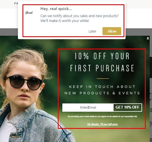
Align the Design of the Banner With Your Website’s Look and Feel
Jennifer Willy, Editor at Etias, explains that it is important to match your pop-up marketing campaign with your website design, interface, and branding; standard templates may end up doing more harm than good.
Having mismatched and ill-designed pop-ups can bring down the success rate of a pop-up. Thus, website owners should take some time to adjust the pop-up box to their site’s look and feel. Here’s an example from Leesa:

You can see that the colors on the pop-up go with the website’s main colors: grey, green, and coral.
You can also see that the CTA button is distinguishable and that the Close button is visible as well; the online store allows for closing the window easily.
Allow a Little, Yet Visible Space for the Pop-up
There might be a misconception that pop-ups should cover the whole page and should not let visitors see the main content. On the contrary, showing a pop-up in the right or left corner of the page can allow the visitor to continue his or her session and get acquainted with your offer at the same time.
Pop-up windows should be large enough to draw attention, while also being small enough to allow the visitor to continue scrolling.
Consider Visitor Needs and Wants and Show Interest-Based Pop-Ups
Website owners should avoid showing pop-ups with the same lead magnet to all blog visitors. Instead, you should offer a free resource based on what blog post you read.
For example, when a visitor is reading about product marketing, you can show a pop-up offering a Product Marketing go-to-market kit. But when the visitor starts reading a sales-related blog post, you can show a pop-up that offers a Sales Metrics Calculator.
Nancy Baker, Managing Editor at Chilmode, supports this approach. She says that whenever she plans to add a pop-up to an article, she puts herself in the viewers’ shoes; she tries to make the popups closely related to the relevant page topic and also makes sure that they appear only on the side of the website.
Individuals typically have good peripheral vision, so putting those pop-ups off to the side can make them less annoying; just make sure the pop-up is eye-catching and has some relevance.
Try to Show Only One Pop-Up at a Time
Polly Kay, Senior Marketing Manager at English Blinds, explains that websites may be apt to throw several pop-ups at visitors. These are often pop-ups notifying users about cookie policies; “This site wants to show notifications” popups, live chat pop-ups, etc. But showing multiple pop-ups early on in a site visit may increase only one of your website metrics —bounce rate.
Below is an example of how three simultaneous pop-ups can take up an entire page and potentially annoy visitors.
Avoid Using Pop-Ups on Form Submission or Purchase Completion Pages
When a visitor wants to fill in purchase details or book a call with you, for example, the last thing you would want to do is to interrupt the process. Because the visitor is already converting, it is typically not an optimal time to show another offer.
Instead, you can ask users to take further steps on your ‘Thank You’ page or in your confirmation email.
Choose Your Pop-up Tool Carefully
While there are many tools in the market that offer set features for your pop-up campaigns, not all of them consider the best practices or leave room for customizations.
An ideal pop-up maker will typically allow you to optimize your pop-ups for different devices, select their position, choose which pages the pop-up should appear on, and the like.
Ask For Additional Information to Send More Targeted Messages
It is often the case that the less information you ask to provide, the more visitors are willing to submit a form. For example, on your pop-up window, you may ask only for an email address.
Website owners should note, though, that exceptions to this can apply that may make the user experience even better. In the example below, J+J asks the visitor to choose all the applicable points to deliver a more targeted experience. We can guess that the online store is going to segment the email subscribers and avoid sending general messages.
You can use a similar approach for any kind of business that has multiple different buyer personas.

Follow Google Guidelines Regarding Mobile Experience
Google Webmaster Central Blog shared official news in 2016 that was titled “Helping users easily access content on mobile”. Google announced that if the main content on a website is not easily accessible on mobile devices, it might not rank high in search results.
For example, if the pop-up is covering the main content, Google regards it as an inconvenience for the user. But “banners that use a reasonable amount of screen and are easily dismissible” do not negatively impact the website’s organic rankings.
Planning a pop-up campaign that is mobile-friendly can yield successful results, as 52.6% of website traffic comes from mobile devices. But you should consider what Google regards as “intrusive” and should try to implement similar tactics on your website’s mobile and desktop versions.
Make the Pop-up Closing Process Easy
Even if your pop-up is converting at 99%, one percent of visitors should have the freedom to close the banner effortlessly.
We have seen pop-ups that do not have the ‘Close’ (x) button somewhere visible on the screen. We have also seen pop-ups that have a “hidden” ‘Close’ button that requires users to scroll to find it.
Forcing your visitor to take an additional step might not provide the best experience for him or her. You should make it extremely easy to close your pop-ups. Whether by clicking the (x) icon or by simply using the Esc key. This rule is applicable to desktop pop-ups as well.
Bottom Line
If you are planning to create a pop-up marketing campaign for your business, you can consider requesting a demo with Adrack to get a better understanding of how Bannerize’s pop-ups work and to see how simple it can be to set them up.